A common reference
Evidence can move.
Judgment remains independent.
LOGOS connects independent forms through one common reference. Shared evidence informs judgment while each institution retains its own decision-making authority.
Evidence can move.
Judgment remains independent.
LOGOS connects independent forms through one common reference. Shared evidence informs judgment while each institution retains its own decision-making authority.
The symbol brings two independent forms into a shared structure. Digitally optimised for clarity and recognition, it expresses connection without removing independence.

A neutral foundation communicates institutional rigour. Editorial typography adds character, while a precise blue accent introduces a distinctive technical signal.
LOGOS communicates with calibrated intelligence and assured direction. Precision creates credibility. Conviction gives the brand presence without overstating what the evidence supports.
Clear about what is known, what is verified and what remains conditional. Precision creates credibility.
A strong opinion about where the market is going. It expresses that belief without hype, arrogance or overstatement.
Explain difficult systems without removing the distinctions that matter.
Have a point of view. Never claim more than the evidence supports.
Technical credibility should be felt through precision, not jargon.
LOGOS is building for a large future problem. Ambition should feel calculated, not reckless.
Trustworthy enough for financial institutions. Modern enough to look like what comes next.
Verify before you transact.
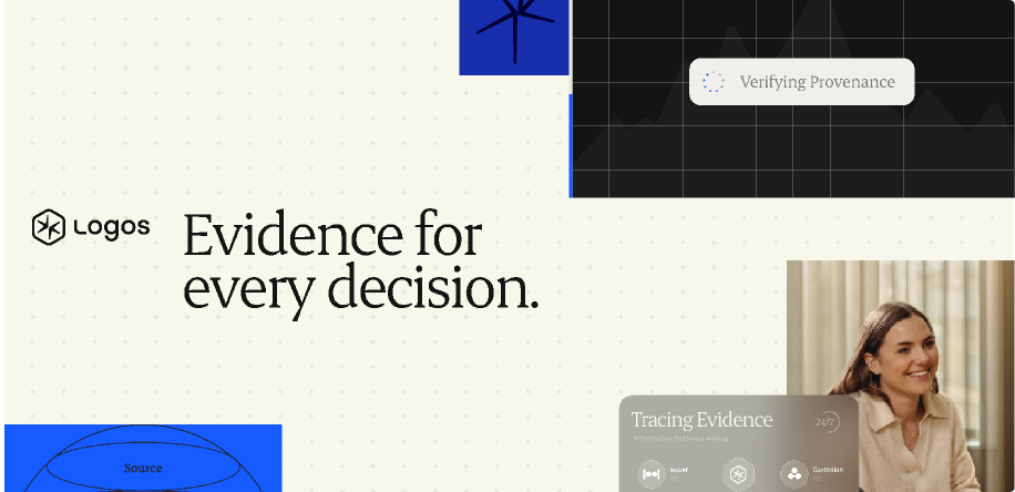
Evidence for every decision.
Mapping the network behind every asset.
Verification built for institutional workflows.
From fragmented data to decision-ready evidence.
Making digital asset exposure traceable.
Know what you own. Know who’s behind it.
From wallet activity to institutional evidence.
From blockchain data to decision-ready evidence.
Tracing assets beyond the wallet.
From asset history to acceptance criteria.
Trust should leave a trail.
Acceptance starts with evidence.
See what others ask you to believe.
Every relationship tells you something.
Trust at face value.
The trust layer between data and decisions.
Look beyond the balance.
A claim is a point. Confidence is the pattern.
What LOGOS must never become.
LOGOS does not decide whether an asset is universally safe.
It does not impose one acceptance policy on the market.
It does not determine eligibility on behalf of every institution.
Authority, provenance and evidence need to remain inspectable.
No token-pumping language, degen or speculative theatre.
The product can be meticulous and methodical. The brand still needs conviction and presence.
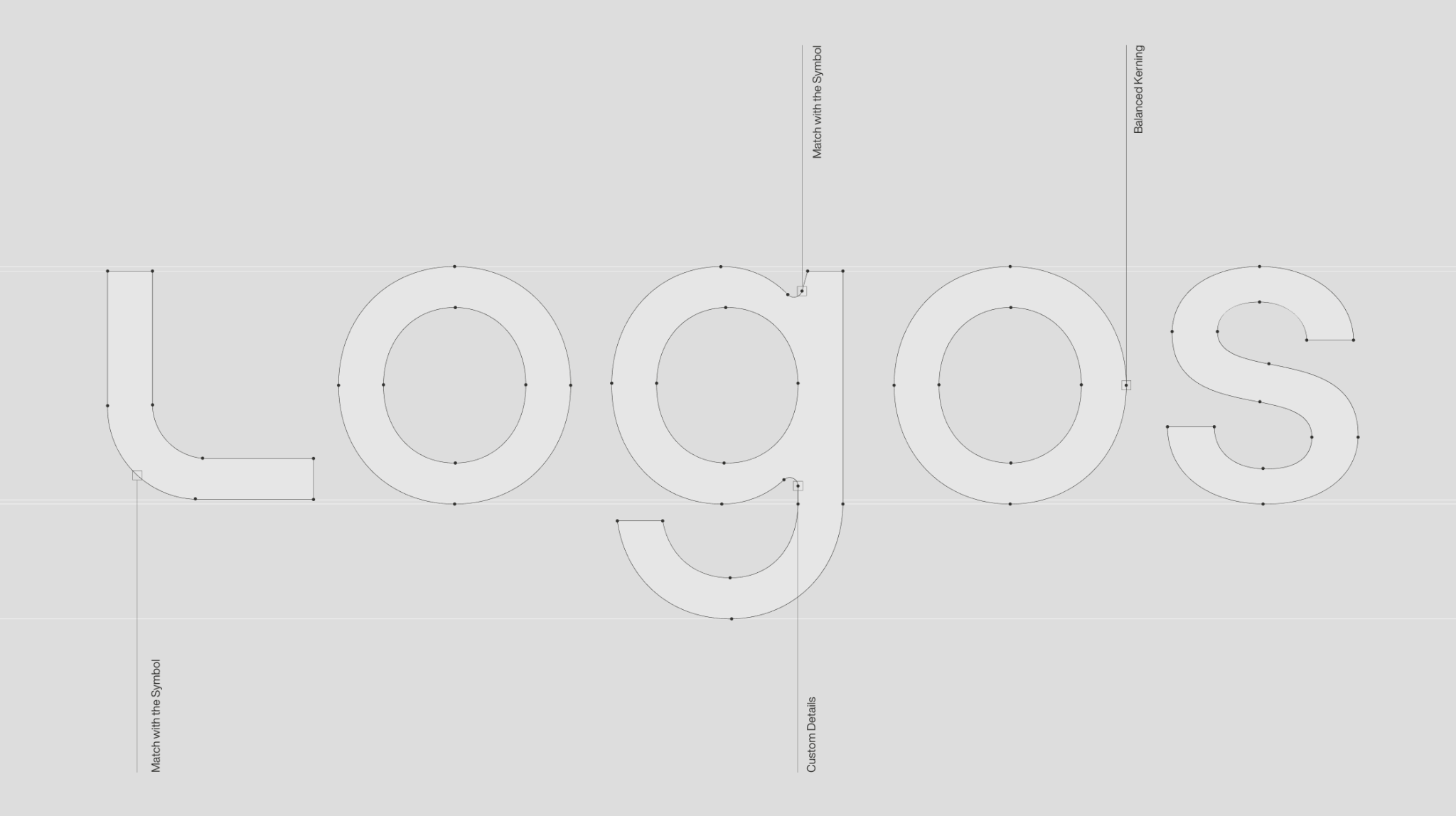
The primary expression of the brand combines the symbol and the LOGOS wordmark.
The symbol is a complementary expression for smaller applications. Two independent forms share one common reference.
Symbol
Choose an original colour version, then download the logo or symbol in the format you need.

Light on black / RGB

Light on black / RGB
Each download uses the exact original file from the supplied logo package. RGB and CMYK versions are available for both the logo and symbol.
The colour selector could not load. Download the original RGB package.
Let x equal the full height of the symbol. Keep at least x/3 clear on every side of the logo and standalone symbol. Divide x by three to define the minimum distance between the artwork and any other logo, text or edge. The guides show this protected area.
Minimum widths are proposed values pending approval. Digital and print specifications must be checked in real applications; print dimensions are not shown to scale.
Minimum width
120 px digital
30 mm print
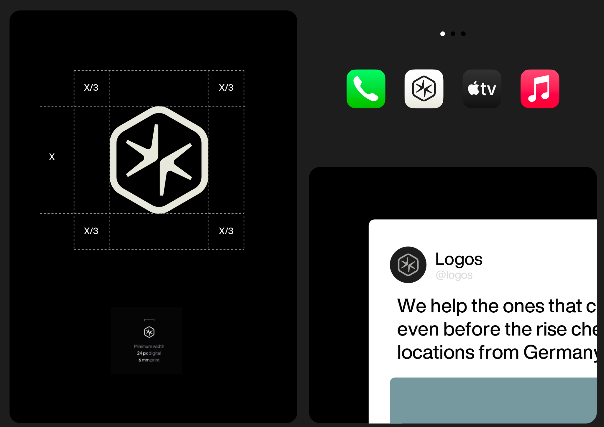
Minimum width
24 px digital
6 mm print
The same x/3 rule applies to all supplied colour versions. Guide lines are explanatory and do not form part of the final artwork.
Preserve the proportions of the identity at every size. This sequence shows the primary logo from large to small.
Proportional scale study. Labels indicate reference widths; previews adapt to the available screen space. The smallest examples demonstrate reduction and are not approved minimum sizes. Follow the minimum-size guidance in the clear-space panels above for production.
Place the logo in a corner or on the centre axis of the layout. Align it to the grid and maintain at least x/3 clear space from surrounding content and edges.
The marks show alternative positions and scales. Use one primary logo per layout.
Protect the consistency and legibility of the identity. These proposed usage examples illustrate how to preserve the original artwork.
Erode Variable by Indian Type Foundry gives headlines an editorial character. Its open counters and long ascenders support expressive statements and confident typography.
Download ErodePlus Jakarta Sans complements Erode with clarity and a contemporary technical character. Use it for supporting text and information.
Download Plus Jakarta Sans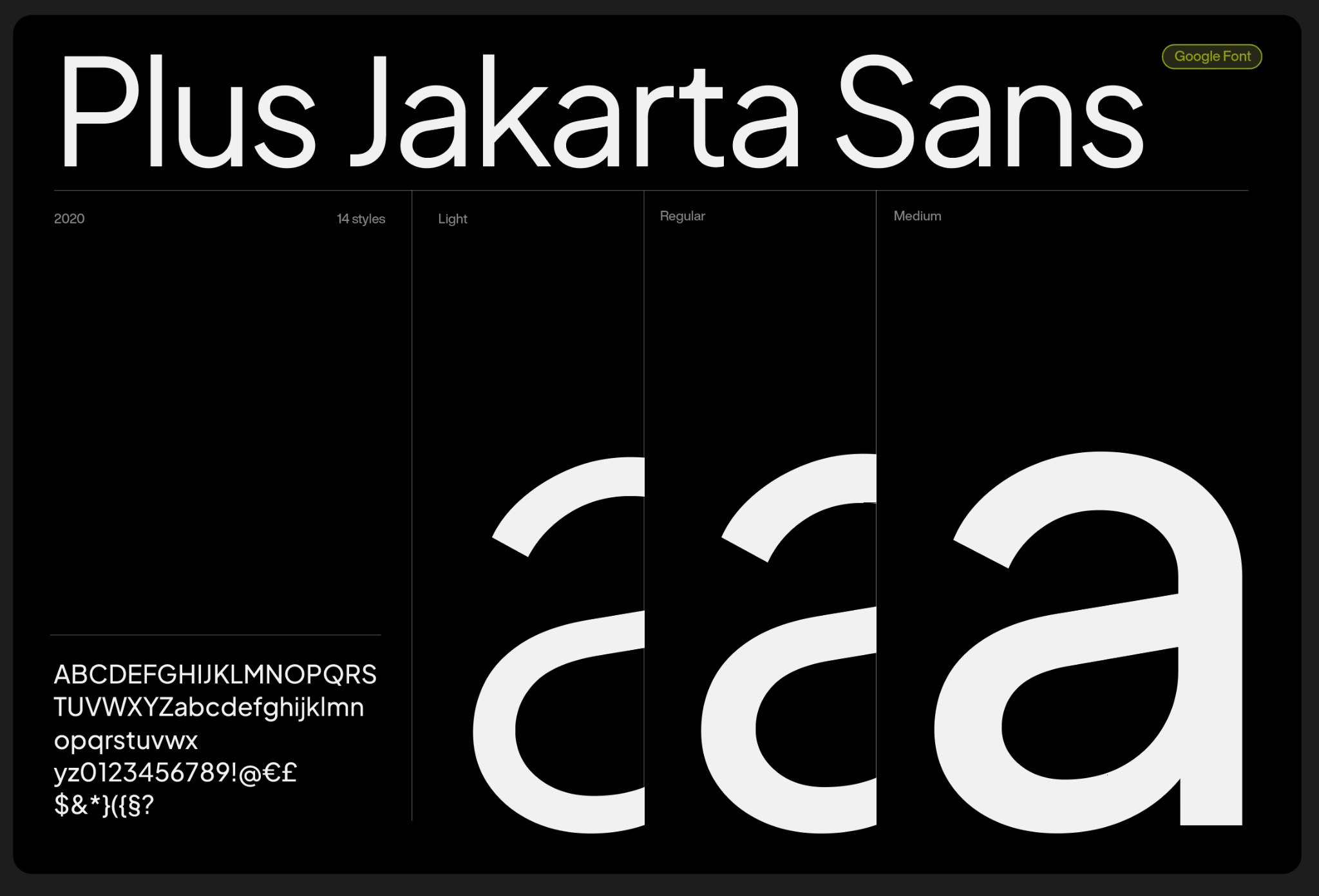
Create a clear difference between headlines, subheadings and supporting copy. Preserve the contrast between the editorial and complementary typefaces.
Erode is applied to this site under the supplied Fontshare licence. Download your copy directly from Fontshare using the button above. Plus Jakarta Sans is supplied with its SIL Open Font License.
The original font files are used in the interactive specimens. Font licences remain included with the relevant resources.
The neutral palette is the foundation of the LOGOS identity. Use it to create calm, clear layouts with an institutional character.
Click any colour to copy its HEX value.
Values transcribed from page 27 of the checkpoint. Confirm the intended print profile before production.
The blue family adds a distinctive technical signal. Use it to bring focus to key elements and introduce contrast within the neutral foundation.
Neutral colours should occupy the largest share of a composition. Use the blue family in smaller amounts, with the lightest blue, Signal blue, reserved for the smallest accents.
01 / Neutral foundationCarbon, ivory and the supporting greys form the main visual field.
02 / Secondary bluesMidnight, Slate blue and Deep blue introduce controlled moments of colour.
03 / Smallest accentUse Signal blue sparingly for precise highlights and points of focus.
Logos Lab is a visual asset generator that transforms the brand symbol into still and moving assets for backgrounds, presentations, social posts and other brand applications.
Choose Glow for luminous glass effects or Flat color for solid-colour visuals. Select from the preset brand colour combinations, then use the controls to adjust shape, colours, light and motion. Drag the preview to rotate the symbol, and use Reset to start again.
Export formats
PNG and SVG for still visuals. GIF, WebM and MP4 for animations.
You can also record as you create. Click Record live, then change the controls or rotate the symbol while recording. Click Stop recording when you are done, choose WebM or animated GIF, and click Download recording.
A selection of visual assets already created with Logos Lab, ready to use in your brand applications. Download the pack for still shapes and animations in PNG, SVG, GIF and MP4 formats.
Professional, but light.
Natural light, warm neutral tones and relaxed compositions create an approachable yet sophisticated photographic language. Soft shadows and authentic expressions bring humanity, while considered environments maintain a professional character.
Natural illumination with gentle shadows, preserving depth.
Restrained, earthy environments that complement the monochromatic identity.
Confident subjects photographed in natural, unforced poses.
Genuine expressions and lived-in environments rather than sterile corporate settings.
Download the complete photography pack with 20 original images.
When the shape is big, and type is also big, they both compete for attention.
What we want is one hero in focus, not two.
We play with visual weight contrast ratios.
80:20 ratio
Use an 80:20 visual weight contrast as a guide: one element leads, while the other supports.
From identity to experience.
The identity in use across digital interfaces, campaigns, stationery and physical materials.